With that in mind, I set out to find some of the images that people have generated of the Internet and its structure.
One of the most impressive projects that I discovered was the Opte Project. While it is a few years old, the project (that graphically represents the internet by mapping relations between class C networks instead of every single IP address) has produced some stunning images.

Here the colours of the lines correspond with geographical data (red for Asia Pacific, green for Europe/Middle East/Central Asia/Africa, blue for North America, and yellow for Latin America and the Caribbean). We can see just how connected everything is and that the clustering is also very high.
The above approach of modeling connections between nodes is very intuitive, but keeps our understanding of the Internet limited to the virtual realm. Once you introduce the real world and its real geography into the equation, visualising data can get a bit more tricky (in that you are trying to encompass several kinds of information over a three dimensional surface). However, there are also some more interesting implications.
One interesting approach I read about involved flattening the earth into a circle, and only using one dimension to represent geographical information. I also appreciated this graph in that it illustrates the heavy tail distribution of node degree in a unique way, via colour gradients.

Finally, an interesting observation that I had when looking for web images: here is an image of the globe taken at night, showing areas lit up by electricity.
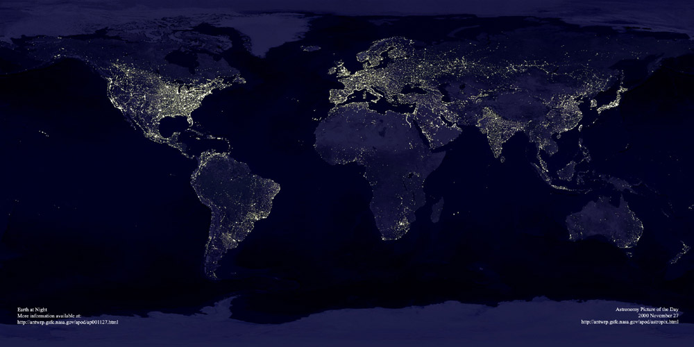

If we consider the facebook graph and areas of reletive intensity, we can see that most people's friends are clustered nearby. Areas that are brightly lit in the facebook graph are therefore areas with high densities of facebook users. Taking the two above images together, we can see that where there is electricity, there is now facebook (except you, China). We've reached the age where the Internet is used by almost everyone who has the electricity to access it.
Other fun images of the Internet :
http://www.technologyreview.com/Infotech/18944/?a=f
http://xkcd.com/256/
Sources:
http://opte.org/
http://discovermagazine.com/2006/oct/map-internet-servers
http://www.princeton.edu/~ina/infographics/lights_earth.html
https://www.facebook.com/notes/facebook-engineering/visualizing-friendships/469716398919
No comments:
Post a Comment